Renewal Experience Improvement
The existing renewal process was very basic and lacked user experience, so the team wanted to provide a full experience to increase subscriptions and encourage renewal.
Research Process

Discover
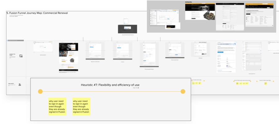
To discover users’ pain points and improvement opportunities, I used "Thinking Out Loud" and "Heuristic Evaluation" methods to conduct As-it Audits for each entitlement.
Define
Pain Point
Through the As-it audits, there is no reminder before the user’s subscription expires, so the user is not aware their subscription will expire soon. In addition, when a subscription expires, the application directs the user to a screen where the user is unsure what to do.
Lack of renewal reminder before expired
Confusing information after taking action
Primary Phase & Applications
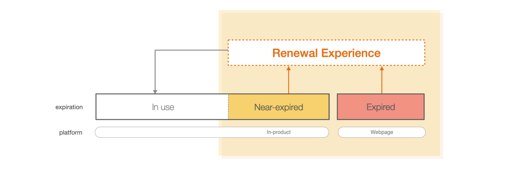
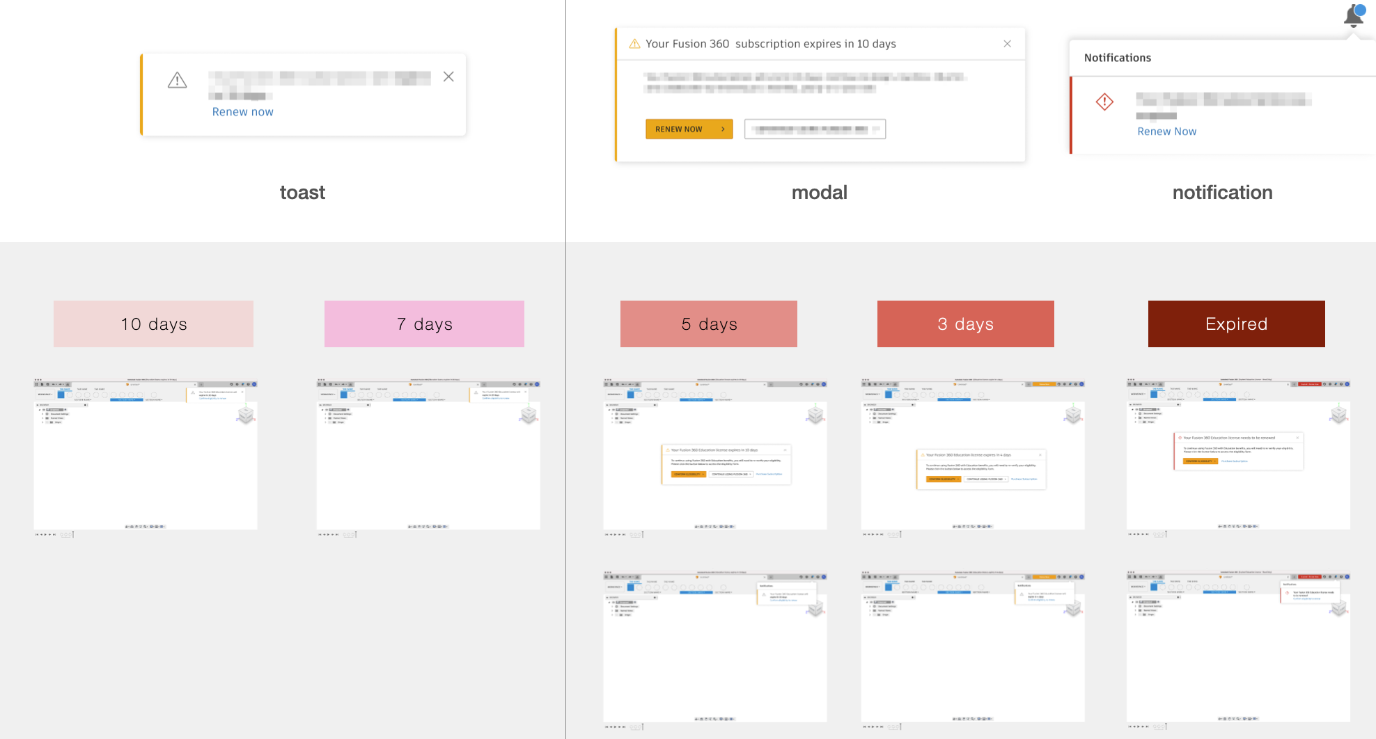
The renewal process is divided into two stages: near-expired and expired. It is relevant on two platforms: In-product application and web page.
Develop
Concept solution
The solution is to find the appropriate time and content for the notification message and to improve the action page.
What Do We Say to Users?
When Do We Talk to Users?
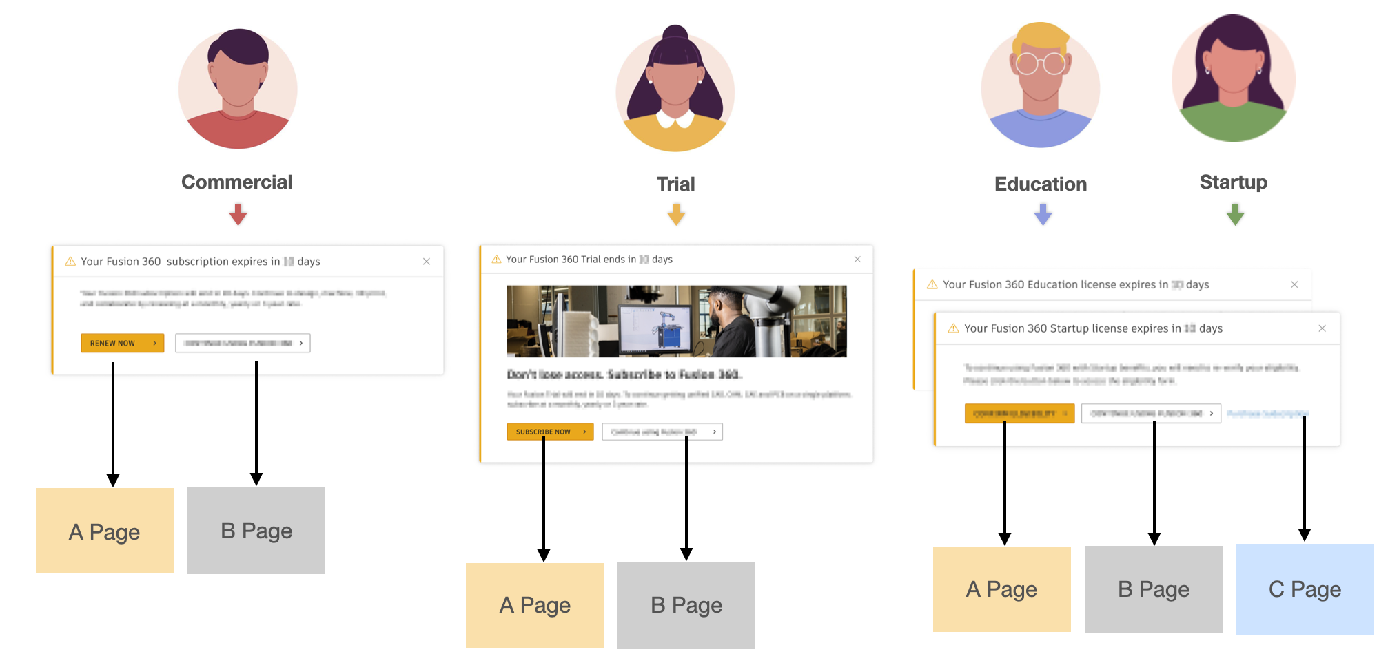
What Happens When Users Take Action?
1 What Do We Say to Users?
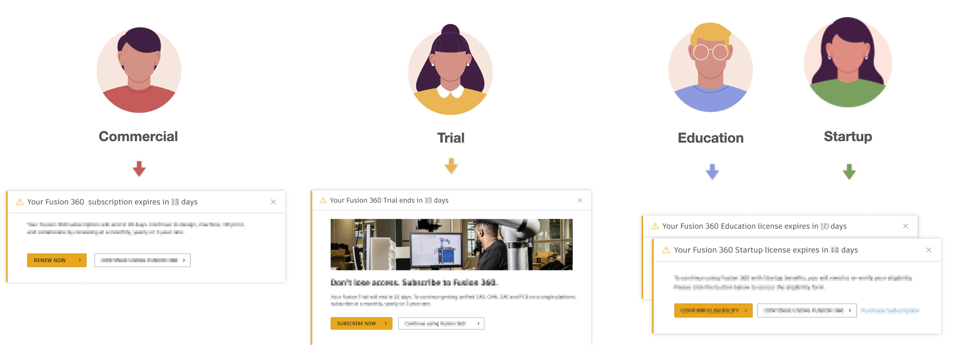
Give each user/entitlement a different message depending on their context. The messages are customized to that moment of the workflow, the situation, and the user goals.
2. When Do We Talk to Users?
Define a time when users should be reminded that their subscriptions are about to expire or have expired and encouraged to renew early.
3. What Happens When Users Take Action?
There are several paths that can be taken depending on the user’s action. I removed some of the current barriers in each path and direct users to the appropriate page to assist in a seamless renewal process. We want to give users very different contexts but the same experience!
Design Solution Validation

Users anticipate going straight to the payment page (without irrelevant information)

Users think that the messaging and timetable are appropriate
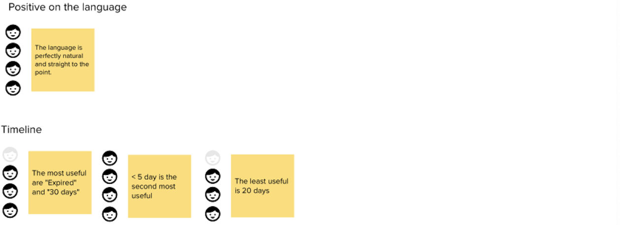
Interesting findings
• Most of the users mentioned they will procrastinate until the last minute
• Discount will compel users to consider to renew
Validate
I created mockups for four entitlements for the user interview after developing the renewal concept. Also, I took part in the researcher’s interviews and integrated the researcher’s notes into the user flow.
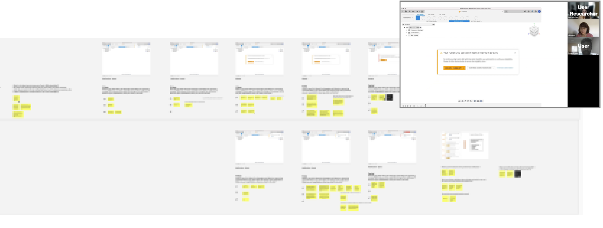
Validation Result
The synthesis verified the concept of assisting people in renewing. Users believe the message’s content and timeline are appropriate. It also confirmed that the user intended to proceed directly to the payment page.
What Do We Say to Users?
Positive
When Do We Talk to Users?
Positive but need to be adjusted
What Happens When Users Take Action?
As expected
Design Solution Validation

Users anticipate going straight to the payment page (without irrelevant information)

Users think that the messaging and timetable are appropriate

Interesting findings
• Most of the users mentioned they will procrastinate until the last minute
• Discount will compel users to consider to renew
Takeaways
By interviewing users through mockups, it can verify that the concept design satisfies the needs of the users and their motives and increases the design’s correctness.
