Platform Access
Platform Access is an experience of first-time user onboarding, the process of registration, login, password reset, and administrator managing access. It is now difficult for administrators to authorize clients’ access because of data gaps and manual approval processes. It has an impact on the business and revenue. The project aims to identify user pain points, provide recommendations, and create a design to lower registration barriers.
Research Process

Empathize
Research Summary
I conducted the UX platform access audit and synthesized interview data to reveal what is causing users headaches and what is decelerating the user’s onboard process.
Research indicates that external users require clarification on the registration and password reset process, and the registration information affects the administrator’s approval.
However, I thought there would be clear rules for roles and access to the platform, but no one on the team knew what they were, and the research didn’t come up with any rules about roles. So next step might be to understand what kind of users and access users need to do their day-to-day work.
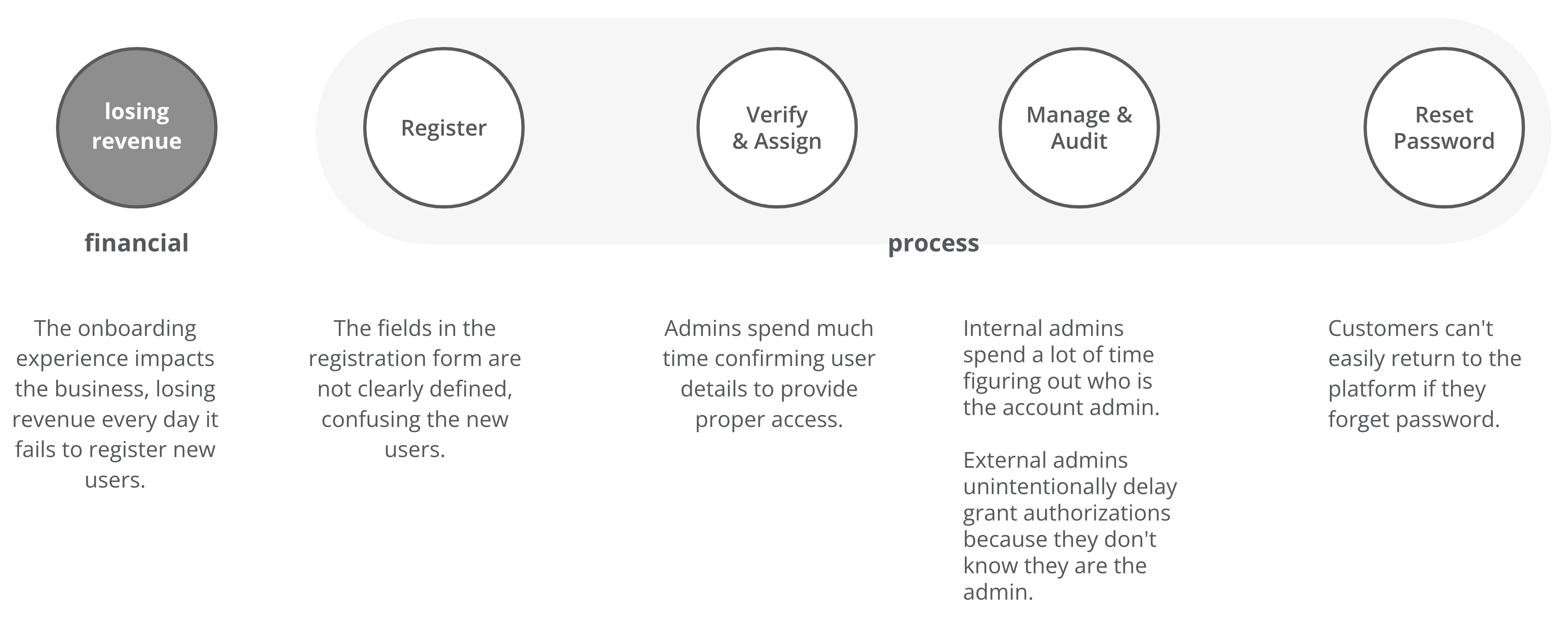
Pain Points
Research Tools
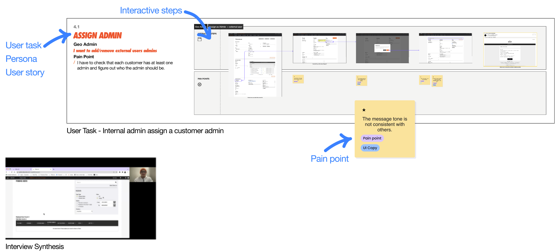
UX Audit & Interview Synthesis
I conducted the UX Audit from both the client’s and administrator’s viewpoints, synthesizing the interviews to understand the users’ objectives, goals, motivations, present experience, and why things were built the way they were and the constraints.
User Flows
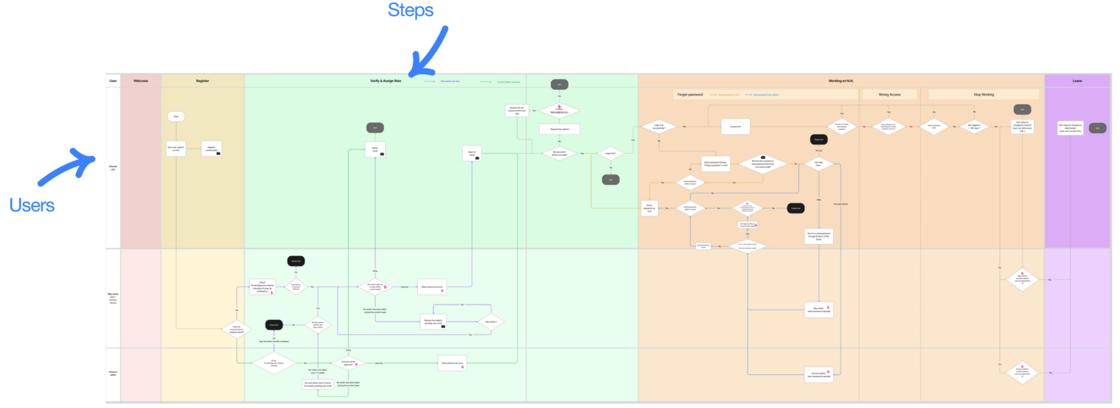
In addition to UX Audit, I created user journey maps to understand the architecture behind the current platform and highlight where it is not smooth and lacking. I divided the step into four horizontal steps: Register, Verify & Assign, Working, and Leave. And I felt there was a lack of a Welcome phase, so I added this step to see any improvement opportunities. In vertical, there are different user roles combination; client and admins, employee and admin. It integrates two sets of user roles vertically: clients and administrators and employees and administrators.
Define
Based on my research, I identified personas, user flows, and key pain points and provided recommendations.
1. Who are users? – identity who are the main users based on my research
New User
Existing User
Non-admin User
Customer Admin
New User
Existing User
Admin
2. What is their current experience? – segmented and defined user experience
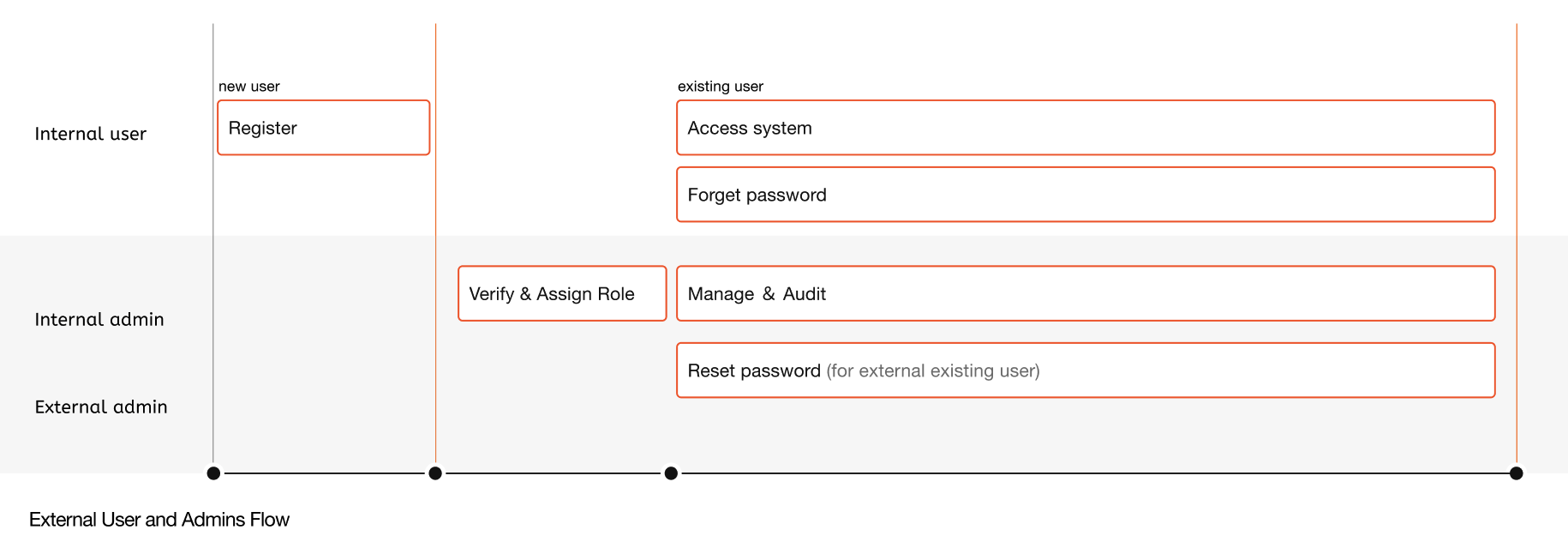
According to the User Flow, I outlined and breakdown the chart into four main stages:
3. What causes user headaches? What are the user’s needs?
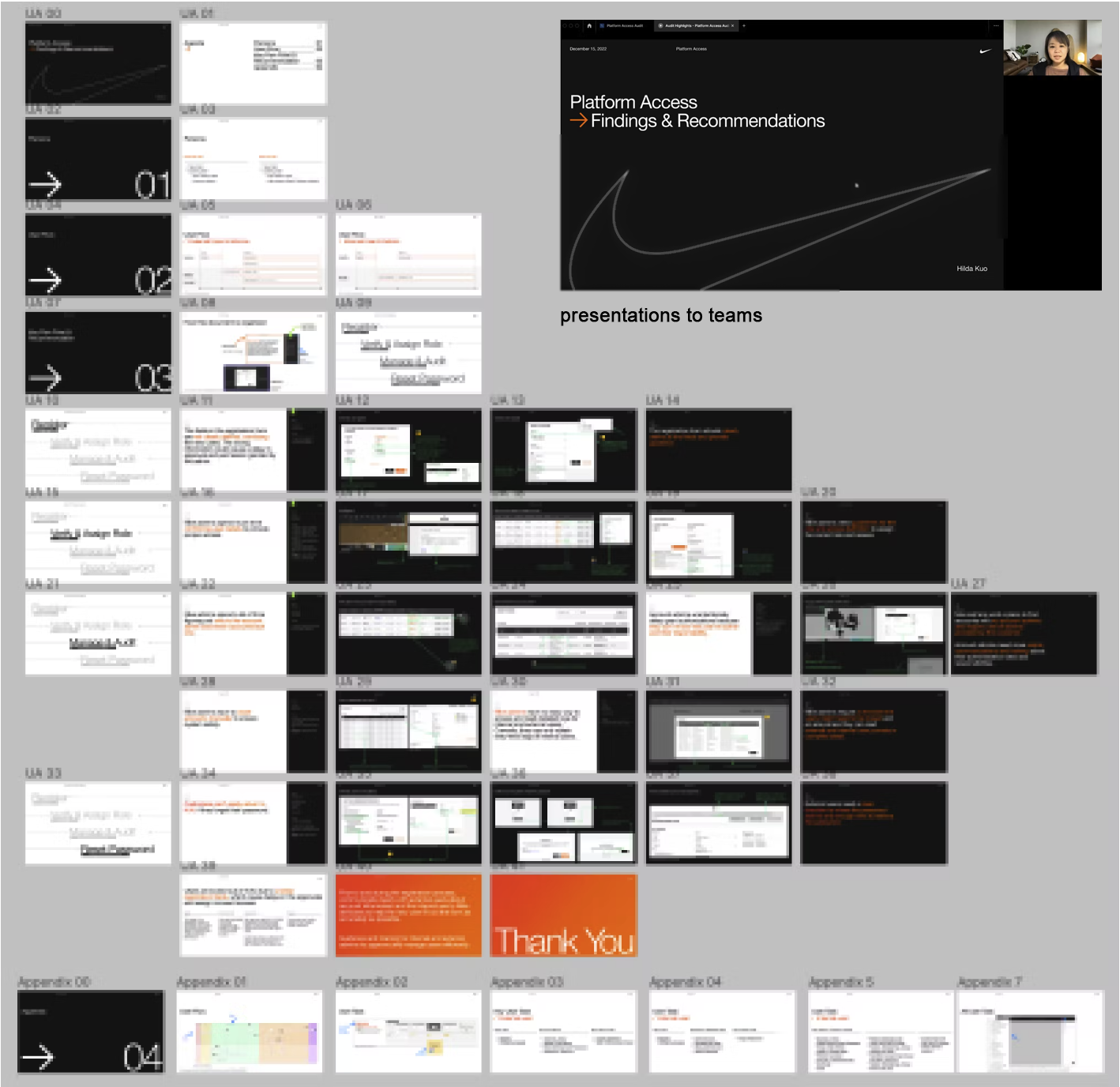
Through the 50 As-it audits, interview synthesis, and user flows, I became the subject matter expert, organized the platform issue screenshots, annotated them, and gave recommendations for each main pain point in an easy-to-read style. Finally, I shared the pain points and recommendations with the project management team and playback them with the design team. The stakeholders may go over the persona and detail user flow once again. The final presentation deck is below.

Ideate
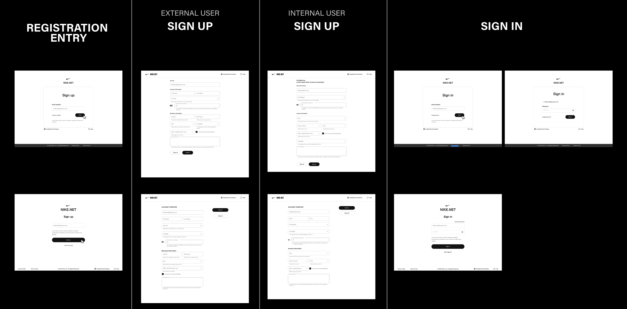
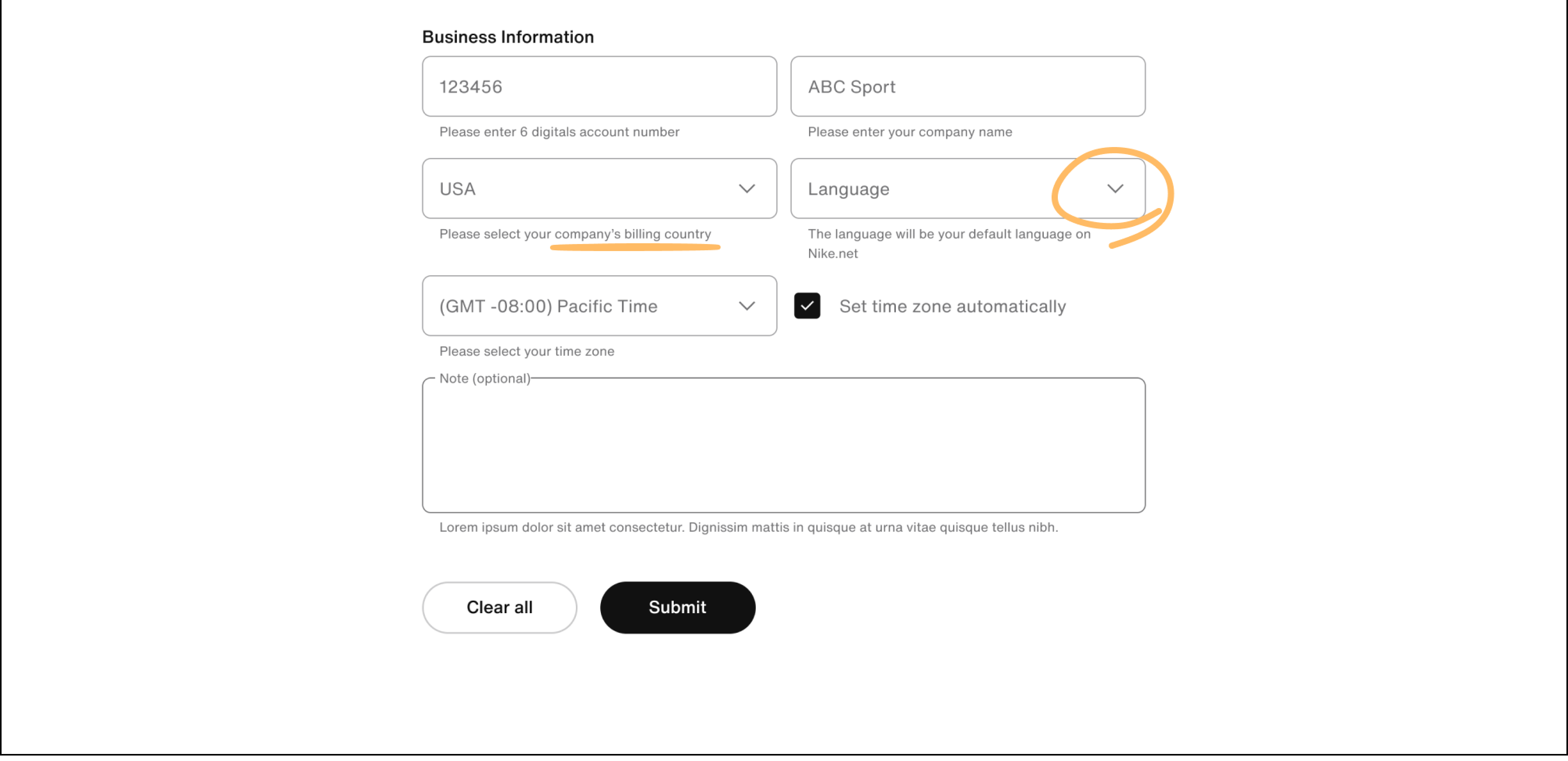
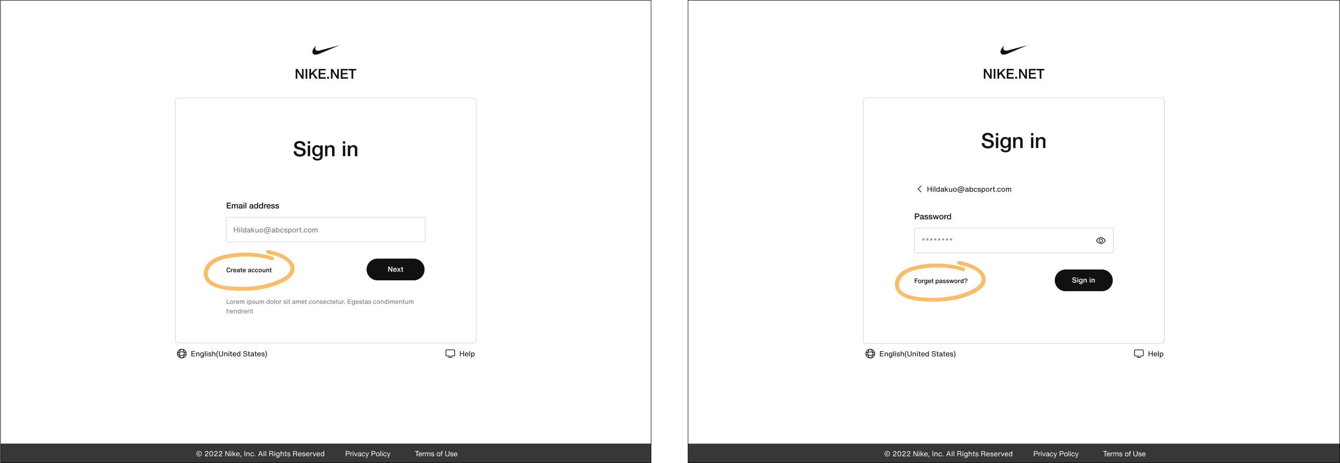
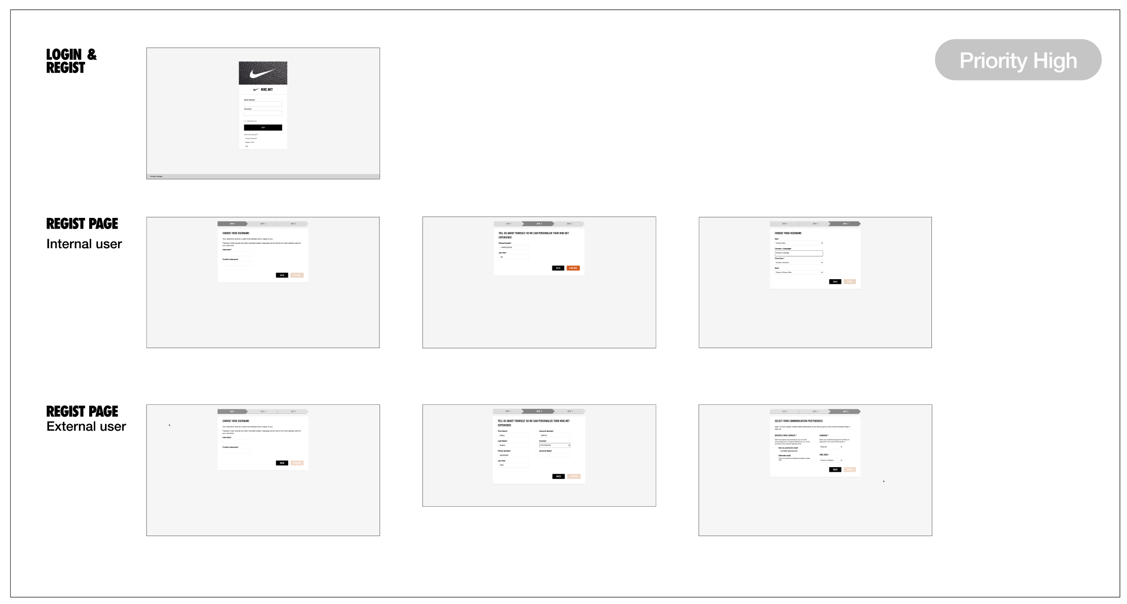
1. Identify the main screensThrough the UX audit, I figured out the screen that related to the Platform Access and prioritized them into high, medium, and low priority. I started from the screens on the high priority and identified four main screens: login, registration portal, and registration pages for both internal and external users.
To ensure the user experience of the register is well defined and the switch between login and register is smooth. I initially created different wireframes to rearrange and regroup the fields for the register page and multiple layouts for the entry of login and register.
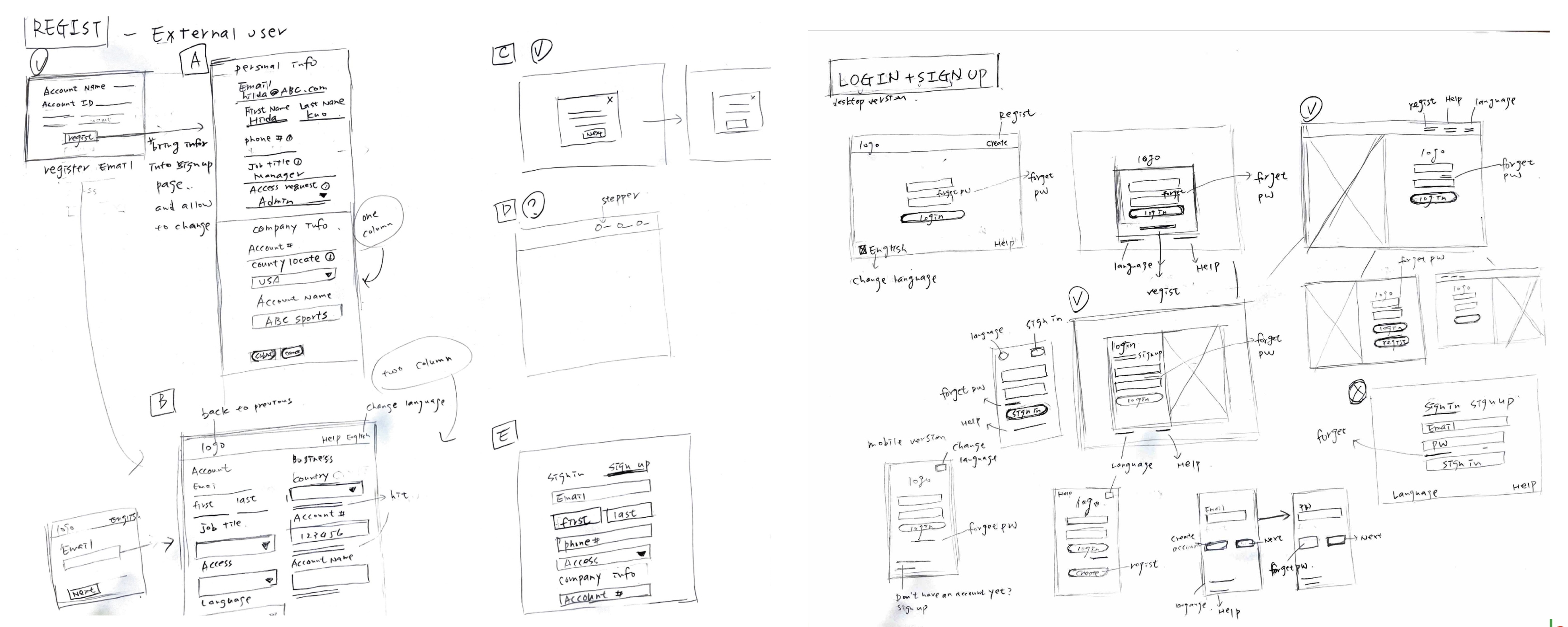
I drafted each screen for a wireframe for many iterations, ensuring that the design solves the user’s pain points. The wireframes highlighted in green will be designed in the low-fidelity prototype.
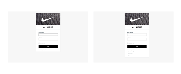
I chose the best user experience concepts and layouts that addressed user pain points and applied the design system to the UI and components.
